Introduction
Today I am announcing a new feature I’ve developed for my website. The feature is a small pop up which will allow visitors to quickly navigate to the latest blog post. As a disclaimer, I will be talking about UI and UX, but I am not a UI/UX professional. As someone who works on backend systems for their day job, frontend development and UI/UX are very much hobby interests of mine. As such, this won’t be the most in depth or accurate breakdown of how to approach UI/UX design for web development.
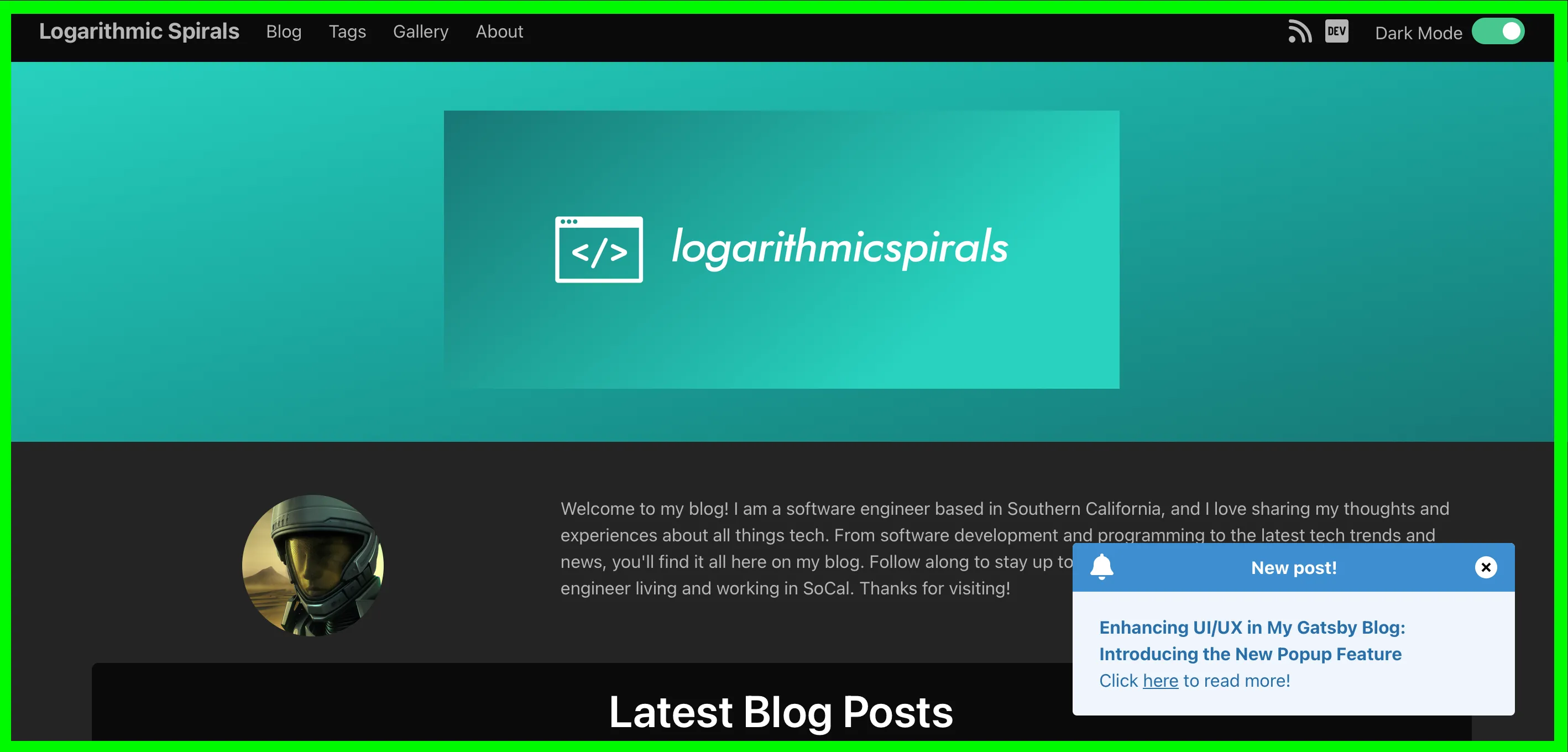
Note: If you’re visiting this post directly on my website, and it’s the latest one posted, you won’t be able to see the popup 😢. See the following screenshot for an example of what it looks like:

Why I Added the Popup
While reviewing search performance results, I observed I’ve been getting more visits from older posts than newer posts. The realization struck me there is an opportunity to help guide new visitors to the latest content. Someone coming to the site for the first time may have a specific article they’re clicking on, but the current layout doesn’t make it easy to find the most recent post.
Designing the Popup
As a long time user of the internet, I’ve come to find certain design patterns to be quite irritating. In fact, I find popups to often be the cause of many high friction experiences which result in frustration. As such, I felt it was important to come up with a design which is minimally intrusive while providing maximum user value.
Initially, my idea was to add a bell icon to the navbar of the site. When a new post would be added to the site, the bell icon would visually change and perhaps have an animation to get the user’s attention. However, I decided against this for now since a bell icon may not be clear as to what it’s trying to notify users about.
As such, I decided trying out a popup would be a suitable alternative.
Building the UI with JSX and Bulma CSS
Conceptually, I wanted the pop up code to be entirely self-contained in its own component. Ideally, the popup wouldn’t need to do very much work on the client side. I broke the popup functionality down into the following steps:
- Get the latest post from the site data.
- Check if the last viewed post from the alert does not match the latest post.
- And if the user is not on the path of the latest post, show the popup. Otherwise, save the latest post into local storage.
- Otherwise, if the last viewed post is the latest post, hide the popup.
As can be seen in those steps, the component uses local storage to control its visibility. By default, the component is hidden and is only displayed when the right conditions are met.
Additionally, I added a button to allow users to dismiss the popup without having to visit the post. The reason for this is I don’t want to annoy people who are visiting the site for a very specific article they want to read and aren’t interested in other content.
The Javascript
Here’s what the code for this component looks like:
import React, { useEffect } from "react";
import { useStaticQuery, graphql, Link } from "gatsby";

const NewPostAlert = ({ path }) => {
  const data = useStaticQuery(graphql`
    {
      allMarkdownRemark(
        sort: { frontmatter: { date: DESC } }
        limit: 1
        filter: { frontmatter: { title: { ne: "" } } }
      ) {
        nodes {
          frontmatter {
            title
          }
          id
        }
      }
      allSitePage {
        nodes {
          pageContext
          path
        }
      }
    }
  `);

  const pageIdToPath = new Map();

  data.allSitePage.nodes.forEach(node => {
    pageIdToPath.set(node.pageContext.id, node.path);
  });

  const latestPostNode = data.allMarkdownRemark.nodes[0];
  const latestPostTitle = latestPostNode.frontmatter.title;
  const latestPostPath = pageIdToPath.get(latestPostNode.id);

  useEffect(() => {
    var lastViewedAlertPost = localStorage.getItem("lastViewedAlertPost");
    var isCurrentPathLatestPost = latestPostPath === path;

    if (lastViewedAlertPost !== latestPostPath) {
      if (!isCurrentPathLatestPost) {
        document.getElementById("new-post-alert").classList.remove("hide");
      } else {
        localStorage.setItem("lastViewedAlertPost", latestPostPath);
      }
    } else {
      document.getElementById("new-post-alert").classList.add("hide");
    }

    document.querySelectorAll(".close-new-post-alert").forEach(node => {
      node.addEventListener("click", () => {
        document.getElementById("new-post-alert").classList.add("hide");

        localStorage.setItem("lastViewedAlertPost", latestPostPath);
      });
    });
  }, [path, latestPostPath]);

  return (
    <div
      id="new-post-alert"
      className="new-post-alert message is-info m-6 hide jiggle"
    >
      <div className="message-header">
        <i className="fa-solid fa-bell fa-xl"></i>
        New post!
        <button
          className="delete close-new-post-alert"
          aria-label="delete"
        ></button>
      </div>
      <div className="message-body">
        <p>
          <b>{latestPostTitle}</b>
        </p>
        <p>
          Click <Link to={latestPostPath}>here</Link> to read more!
        </p>
      </div>
    </div>
  );
};

export default NewPostAlert;
Note the popup requires the current path to function. The way I’m using it is to embed it inside of layout component which is used to create the basic structure of each page. The layout component gets passed the page location and is used for every page on my website.
The CSS
For this component, I opted to style and structure the popup as a Bulma message component. However, you can see I have some CSS classes called new-post-alert, jiggle, and hide which are not part of Bulma. Here’s the code for those classes:
.hide {
  display: none !important;
}

@keyframes fade-in {
  from {
    opacity: 0;
  }

  to {
    opacity: 1;
  }
}

@keyframes jiggle {
  0%, 100% { transform: scale(1); }
  10% { transform: scale(1.05); }
  20% { transform: scale(1.1); }
  30% { transform: scale(1.05); }
  40% { transform: scale(0.95); }
  50% { transform: scale(1); }
  60% { transform: scale(1.03); }
  70% { transform: scale(0.97); }
  80% { transform: scale(1.01); }
}

.new-post-alert {
  position: fixed;
  bottom: 0;
  right: 0;
  max-width: 400px;
  animation: jiggle 0.5s ease-in-out 3s, fade-in 0.5s ease forwards;
}

.new-post-alert > .message {
  max-width: 300px;
}
The hide class is simply used to control the component’s visibility. The jiggle and fade-in animations are used to influence the user experience. As you can see in the new-post-alert, the animation fades in quickly over half a second, and then three seconds later does a small jiggle. The jiggle is to help get the user’s attention.
UX Principles in Action
Since I’m not exactly a UI/UX expert, I had to rely on external sources for determining what principles to consider when thinking about the user experience. Some of the UX principles I followed when developing the feature were:
- Consistency: The popup maintains consistency with overall design of the blog by making further use of Bulma’s CSS classes. This ensures a cohesive user experience.
- Hierarchy: Importance is given to prominently displaying the latest blog post, guiding users intuitively through the site’s content.
- User Control: Users have the freedom to dismiss the popup, providing control over their browsing experience.
You can read more about these principles, and others, on the CareerFoundry blog and the UX Design Institute blog.
Conclusion
The main thing I had reinforced while working on this was good design is hard. While I am proud of having developed this feature, I am still able to think of ways to improve it. For example, I could add a setting to the site so users are able to completely disable the popup. Another thing I could improve is the accessibility of the feature. Of course, the site is very much a constant work in progress so I will probably be working on updates for such things at some point in the future.
Developing this popup feature has been an enlightening journey into the world of UI/UX, albeit from a backend developer’s perspective. It underscored for me the delicate balance between functionality and user experience. While the current iteration serves its purpose, I see room for improvement, such as enhanced accessibility options and user customization features. This project has been a valuable reminder websites are like living entitiea, always evolving to better meet user needs. As I continue to refine my skills and this site, I look forward to implementing more user-centric features which align with the core principles of UI/UX design.


