Introduction
Are you looking to add an interesting feature to your self-hosted tech blog? Adding a photo gallery can be a great way to showcase your photography skills or simply add visual interest to your site. When I decided to add a photo gallery to my Gatsby-based blog hosted on DigitalOcean, I thought it would be a fun and rewarding project. However, I encountered some challenges along the way that required me to find solutions. In this blog post, I’ll share my journey of finding a React-based lightbox package, storing high-resolution photos, and getting the images at build-time for Gatsby. By sharing my experience of building a Gatsby image gallery, I hope to provide helpful insights and tips for your own photo gallery project.
Finding a React-Based Lightbox Package
Overview of the Issue
When it comes to adding a photo gallery to a website, selecting the right lightbox package can make all the difference. A lightbox package is a tool that allows website visitors to click on an image and view it in a larger, more detailed format. There are many lightbox packages available, but not all of them are created equal. Some may be too difficult to set up or customize, while others may not be fast or efficient enough for your needs.
When I began searching for a suitable lightbox package for my Gatsby-based blog, I quickly realized that finding the right one would be a challenge. I needed a package that was easy to set up and customize, fast and efficient in displaying images, and compatible with my website’s tech stack. Additionally, I wanted a package that was actively supported by a community of developers and users. After researching several options, I finally settled on a package that met all of my criteria.
Researching Available Options
Evaluation Criteria
- Ease of use: How easy is the package to set up and use?
- Customizability: Can the package be customized to fit your specific needs and design preferences?
- Performance: How fast and efficient is the package in rendering and displaying images?
- Compatibility: Is the package compatible with your website’s tech stack, including React and any other relevant dependencies?
- Community support: Does the package have an active community of developers and users who can offer support and troubleshooting?
- License: Is the package’s license compatible with your website’s license and intended use?
Now, as far as these criteria go, I think the least important one for me right now is #2. If anything, customizability is a bonus which I can use later to enhance the site’s appearance. With that being said, the order of importance for me is the following:
- License
- Compatibility
- Ease of use
- Performance
- Community support
- Customizability
Selection of the Lightbox Package
After evaluating several lightbox packages, I ultimately chose the yet-another-react-lightbox package for my photo gallery. This package met my evaluation criteria in several ways:
- Ease of use: The package was straightforward to install and set up, and the documentation was clear and helpful.
- Customizability: The package provided several customization options, including the ability to change the layout, styling, and behavior of the lightbox.
- Performance: The package was fast and efficient in rendering and displaying images, which was important for my website’s performance.
- Compatibility: The package was compatible with my website’s tech stack, including React and Gatsby, and did not require any additional dependencies.
- Community support: The package was actively maintained and had a community of users who were able to offer support and troubleshooting.
- License: The package’s MIT license was compatible with my website and its intended use.
Overall, I found the “yet-another-react-lightbox” package was a great choice for my photo gallery project. It was easy to use, fast and efficient, and provided the customization options I needed to make my gallery look and feel just right.
First Attempt at Writing the Code
Here’s what the code roughly looked like when it was initially written:
// ... imports

const GalleryIndex = ({ data, location }) => {
  const siteTitle = data.site.siteMetadata?.title || `Title`
  const imageNodes = data.allFile.nodes.map(node => node.childImageSharp)
  const slides = imageNodes.map(node => {
    return { src: node.original.src }
  })
  const images = []
  images.push([])

  var imageRowIndex = 0

  for (var i = 0; i < imageNodes.length; i++) {
    if ((i + 1) % 3 === 0) {
      images.push([])
      imageRowIndex++
    }

    images[imageRowIndex].push(imageNodes[i])
  }

  const [index, setIndex] = useState(-1)

  return (
    <Layout location={location} title={siteTitle}>
      <Lightbox
        open={index >= 0}
        index={index}
        close={() => setIndex(-1)}
        slides={slides}
      />
      <div className="container">
        <div>
          <h1 className="title is-1 has-text-centered">Photo Gallery</h1>
          <p className="has-text-centered">
            {/* In the final version, there's a paragraph here. I've removed it for brevity. */}
          </p>
        </div>
        <hr />
        <div className="tile is-ancestor">
          <div className="tile is-vertical">
            {images.map((imageRow, index) => {
              return (
                <div className="tile is-parent" key={index}>
                  {imageRow.map((image, index) => {
                    return (
                      <div className="is-4 is-child p-2" key={index}>
                        <div
                          className="is-clickable"
                          onClick={event => setIndex(index)}
                          onKeyDown={event => setIndex(index)}
                          role="presentation"
                        >
                          <GatsbyImage alt="" image={getImage(image)} />
                        </div>
                      </div>
                    )
                  })}
                </div>
              )
            })}
          </div>
        </div>
      </div>
    </Layout>
  )
}
The images in this version were stored locally alongside the code. The data for the page was provided by the following GraphQL query:
{
  site {
    siteMetadata {
      title
    }
  }
  allFile(
    filter: {
      sourceInstanceName: { eq: "images" }
      relativeDirectory: { eq: "gallery" }
    }
    sort: { fields: name, order: ASC }
  ) {
    nodes {
      childImageSharp {
        gatsbyImageData(
          quality: 100
          webpOptions: { quality: 100 }
          jpgOptions: { progressive: true, quality: 100 }
          placeholder: BLURRED
        )
        original {
          src
        }
      }
    }
  }
}
Keep in mind there’s a bug here. The index used from the nested map calls causes some clicked images to open the lightbox to the wrong image. However, this was fixed before the code went live. But here you can see how I’ve set up the page. Images are displayed using Gatsby image components. The benefit of this is that the Gatsby image plugin provides performance benefits. For example, you can see in the GraphQL that I have placeholder: BLURRED specified. With this, the images are lazy loaded on page load. A blurred version is displayed until the actual image is ready to view. This keeps the page from changing structure while the assets load and decreases the amount of time it takes the page to render. However, I had to add the is-clickable class from Bulma so that hovering over the images would cause the cursor to change in a way which indicates the image can be clicked.
One important thing to note is how the image nodes returned from the query are mapped to a new array called slides. The objects in the slides array have a different shape in the nodes array. This is so that the array can be passed to the lightbox component to display the images. The documentation for yet-another-react-lightbox provides an example of a photo gallery. The example is available on CodeSandbox and shows the shape of the slide objects expected by the lightbox component when the slides plugin is used.
There’s a more serious problem with this approach though. The files for the images I was wanting to display were far too big to store with the source code in my version control system. When pushing the changes, it took a few minutes for all the data to be pushed to the remote repository. To me, that’s not a recipe for success. Code should be quick and easy to change, and storing media prevents that. So, I had to look into other ways to store the photos.
Storing High-Resolution Photos for the Gatsby Image Gallery
What I ended up deciding on was using object storage for the high-resolution images. There are different object storage solutions out there (most famously Amazon S3), but I decided to use DigitalOcean’s Spaces because I already host the site there using App Platform.
DigitalOcean Spaces
Adding DigitalOcean Spaces was fairly straightforward. Spaces provides an S3-compatible API, so packages which work with S3 should also work easily with Spaces. However, using object storage for photos presents a new challenge. How do the photos get from a Spaces bucket into the build?
Getting Images at Build-Time
While it would be possible to set up a custom solution to this problem, there are multiple plugins available for Gatsby which already offer a solution. Thankfully, Gatsby aggregates those plugins and displays them, with a search function, at the Gatsby Plugin Library. Searching for s3 shows multiple results, but I started at the top and worked my way down:
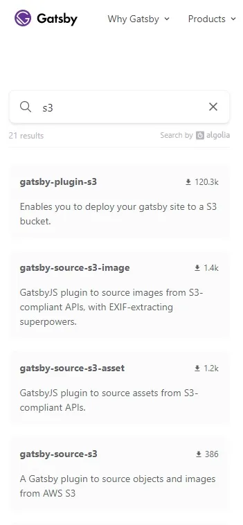
When it came to actually deciding on a plugin, I used the same criteria used to pick a lightbox package. The first plugin, gatsby-plugin-s3, doesn’t actually do what I was looking for. It’s a plugin used for deploying a Gatsby site to S3. The second option, gatsby-source-s3-image, seemed promising. However, it hasn’t been maintained for a long time and has no license. Next up was gatsby-source-s3-asset. Unfortunately, this project also hasn’t been maintained in years and is also missing a license. Even if the plugins worked, the missing licenses are problematic because as I understand it repos without licenses default to copyright protection (I’m not a lawyer, please don’t take this as legal advice).
After seeing those plugins not meet my requirements, I was somewhat concerned about actually being able to find a plugin. Fortunately, I looked at gatsby-source-s3 and found it to fit my needs perfectly.
NOTE: DigitalOcean has an article which covers using AWS SDKs with Spaces. I won’t be going into detail on that here.
Using gatsby-source-s3
gatsby-source-s3 is a simple, straightforward plugin which allows for objects and images to be pulled from S3 compatible services into a Gatsby project at build time. The objects are then accessible with GraphQL queries just like other forms of data like files on the file system. The plugin is part of a monorepo project called plugins under the gatsby-uc organization on GitHub (gatsby-uc standing for Gatsby User Collective). The repo is very actively maintained and under an MIT license. Here’s a quote from the Gatsby User Collective website:
The GUC exists to empower the Gatsby community to build and maintain the plugins we use every day. Instead of waiting on a burned-out maintainer or distracted company, anyone can be a maintainer. Those maintainers do the work they want when they want to do it.
After having worked on this photo gallery for a few days, I’m quite thankful for the project existing and the work of individuals like Alex Moon who have kept things running over there.
Finding and Fixing an Error
Even with all the benefits of the community and project setup, and gatsby-source-s3 working perfectly fine after installing, I noticed an error message would be displayed in the console during development and builds. Here’s what it looked like:

It seemed this may have been a relatively recent development for the AWS SDK for JavaScript, so I turned back to the plugins project and created an issue indicating the problem. However, I saw the project seemed welcoming to contributors, so I volunteered to fix the issue in the comments. Alex Moon was very quick to respond, and I subsequently got to work.
The problem presented by the upgrade from v2 to v3 for the AWS SDK was interesting. v3 is a complete rewrite, so there are some fundamental differences between v2 and v3. Those differences ended up carrying over to the fix for the plugin. You can see all the changes I made in the pull request I opened.
Again, Alex was very quick to respond and engage with me on this issue (thank you, Alex!). It didn’t take very long for my fix to be reviewed, approved, merged, and released. When I started on this effort, the plugin was at version 3.2.4, but is now at version 4.0.0. You can see version 4.0.0 of the plugin is now available through npm.
This little side quest ended up being very much a happy accident. It was quite rewarding to find this plugin, see a bug, fix it, and then get to use the fixed version right away.
The Final Product
Here’s what the code for gallery page looks like now:
// ... imports

const GalleryIndex = ({ data, location }) => {
  const siteTitle = data.site.siteMetadata?.title || `Title`
  const imageNodes = data.allS3Object.nodes.map(
    node => node.localFile.childImageSharp
  )
  const slides = data.allS3Object.nodes.map(node => {
    const bodyMake = node.fields.exif.technical.bodyMake
    const bodyModel = node.fields.exif.technical.bodyModel
    const lensMake = node.fields.exif.technical.lensMake
    const lensModel = node.fields.exif.technical.lensModel

    return {
      src: node.localFile.childImageSharp.original.src,
      title: node.fields.exif.title,
      description: `Shot with a ${bodyMake} ${bodyModel} body and ${lensMake} ${lensModel} lens`,
    }
  })
  const images = []
  images.push([])

  var imageRowIndex = 0

  for (var i = 0; i < imageNodes.length; i++) {
    if ((i + 1) % 3 === 0) {
      images.push([])
      imageRowIndex++
    }

    imageNodes[i].nodeIndex = i

    images[imageRowIndex].push(imageNodes[i])
  }

  const [index, setIndex] = useState(-1)

  return (
    <Layout location={location} title={siteTitle}>
      <Lightbox
        open={index >= 0}
        index={index}
        close={() => setIndex(-1)}
        slides={slides}
        plugins={[Captions, Zoom]}
      />
      <div className="container">
        <div>
          <h1 className="title is-1 has-text-centered">Photo Gallery</h1>
          <p className="has-text-centered">
            {/* Paragraph removed for brevity. */}
          </p>
        </div>
        <hr />
        <div className="tile is-ancestor">
          <div className="tile is-vertical">
            {images.map((imageRow, index) => {
              return (
                <div className="tile is-parent" key={index}>
                  {imageRow.map((image, index) => {
                    return (
                      <div className="is-4 is-child p-2" key={index}>
                        <div
                          className="is-clickable"
                          onClick={event => setIndex(image.nodeIndex)}
                          onKeyDown={event => setIndex(image.nodeIndex)}
                          role="presentation"
                        >
                          <GatsbyImage
                            alt={slides[image.nodeIndex].title}
                            image={getImage(image)}
                          />
                        </div>
                      </div>
                    )
                  })}
                </div>
              )
            })}
          </div>
        </div>
      </div>
    </Layout>
  )
}
Now, one might be wondering what the EXIF data parts I added are. After looking into plugins to work with images and object storage, I got an understanding of how to add nodes to the graph API. Unfortunately, I wasn’t really able to find a plugin which worked for me to get the EXIF data. I found this comment showing how to add EXIF data which was super helpful. Later down the thread, the commenter links to a plugin they published which solves the EXIF data problem. The plugin is called gatsby-plugin-sharp-exif. However, this plugin didn’t quite work for me because of conflicting Gatsby versions. I’m locked into version 4 because I’m currently hosting on App Platform, and the plugin only seems to work with Gatsby version 2 or version 5. What I ended up doing was writing my own custom node creator which piggybacks off of gatsby-source-s3 rather than gatsby-plugin-sharp because the image sharp data is available from the S3 object nodes. I decided to use a different structure to the one gatsby-plugin-sharp-exif uses which is better suited to populating the data I need on the page.
The approach I’m using now is to use the EXIF data for the images to populate the title and description for each image’s respective slide in the lightbox (and also populate the alt text for accessibility). I also fixed the bug I mentioned earlier by adding the nodeIndex property to image objects used to render the thumbnails on the page.
The updated GraphQL query for the page is as follows:
{
  site {
    siteMetadata {
      title
    }
  }
  allS3Object(sort: { fields: localFile___name, order: DESC }) {
    nodes {
      localFile {
        childImageSharp {
          gatsbyImageData(
            quality: 100
            jpgOptions: { progressive: true, quality: 100 }
            webpOptions: { quality: 100 }
            placeholder: BLURRED
          )
          original {
            src
          }
        }
      }
      fields {
        exif {
          title
          technical {
            bodyMake
            bodyModel
            lensMake
            lensModel
          }
        }
      }
    }
  }
}
Conclusion
Creating a Gatsby image gallery was a fun and rewarding project, but it was not without its challenges. Finding the right React-based lightbox package and object storage solution proved to be the most difficult hurdles, but with a little research and some trial and error, I was able to overcome them and create a Gatsby gallery I am proud of.
In the end, I learned that evaluating and selecting the right tools and solutions for a project is key to its success. By considering criteria such as ease of use, customizability, performance, compatibility, community support, and license, I was able to make informed decisions and ultimately achieve my desired outcome.
I hope that my experience can be helpful to others who may be embarking on a similar project. With the right tools and a bit of perseverance, creating a photo gallery can be a fun and rewarding addition to any website. By embarking on little projects like this, many doors open up. One may even find an opportunity to contribute to an open source project along the way.
If you’re interested in seeing the final results of this project live, you can visit my photo gallery at https://logarithmicspirals.com/gallery.
